For this entry, I wanted to briefly dive into the world of digital design, and specifically how it evolved over the past decade or so. Let's dive right in.
One of the first noticable impressions of digital design spurred from *one of* the pioneers of consumer computers Steve Jobs himself. Putting aside my hatred for apple's ecosystem
of overly priced, corporate-world, gen X machines, Steve Jobs invented a new kind of wheel that started with the idea of simplicity in computers.
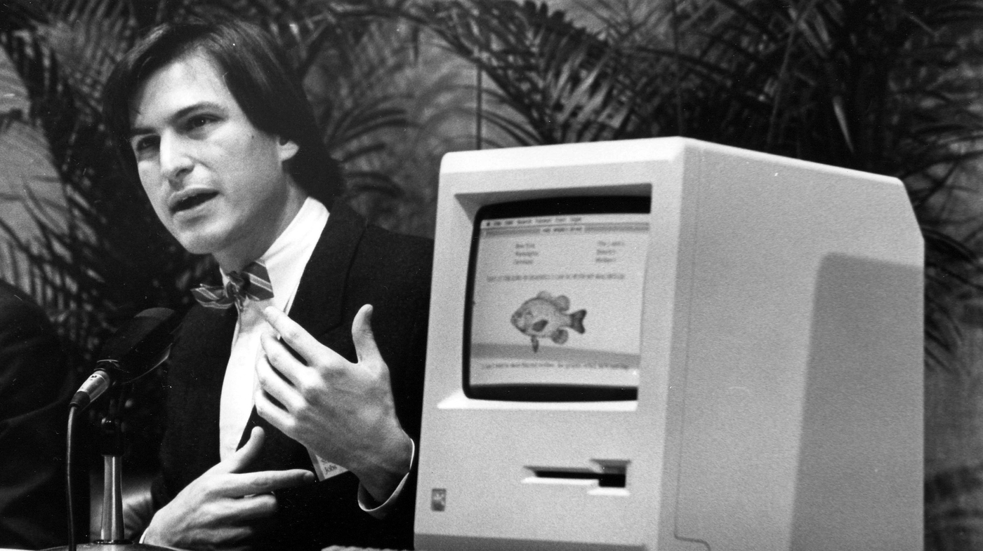
The whole idea was to change the perception of what a computer was/is. During that time, machines were largerly for research and wartime production, so it was exciting to see
a computer that can abstract the complexities of its functionality. Steve jobs iterated through many designs to make it work, but one of the first creations was the IMac.
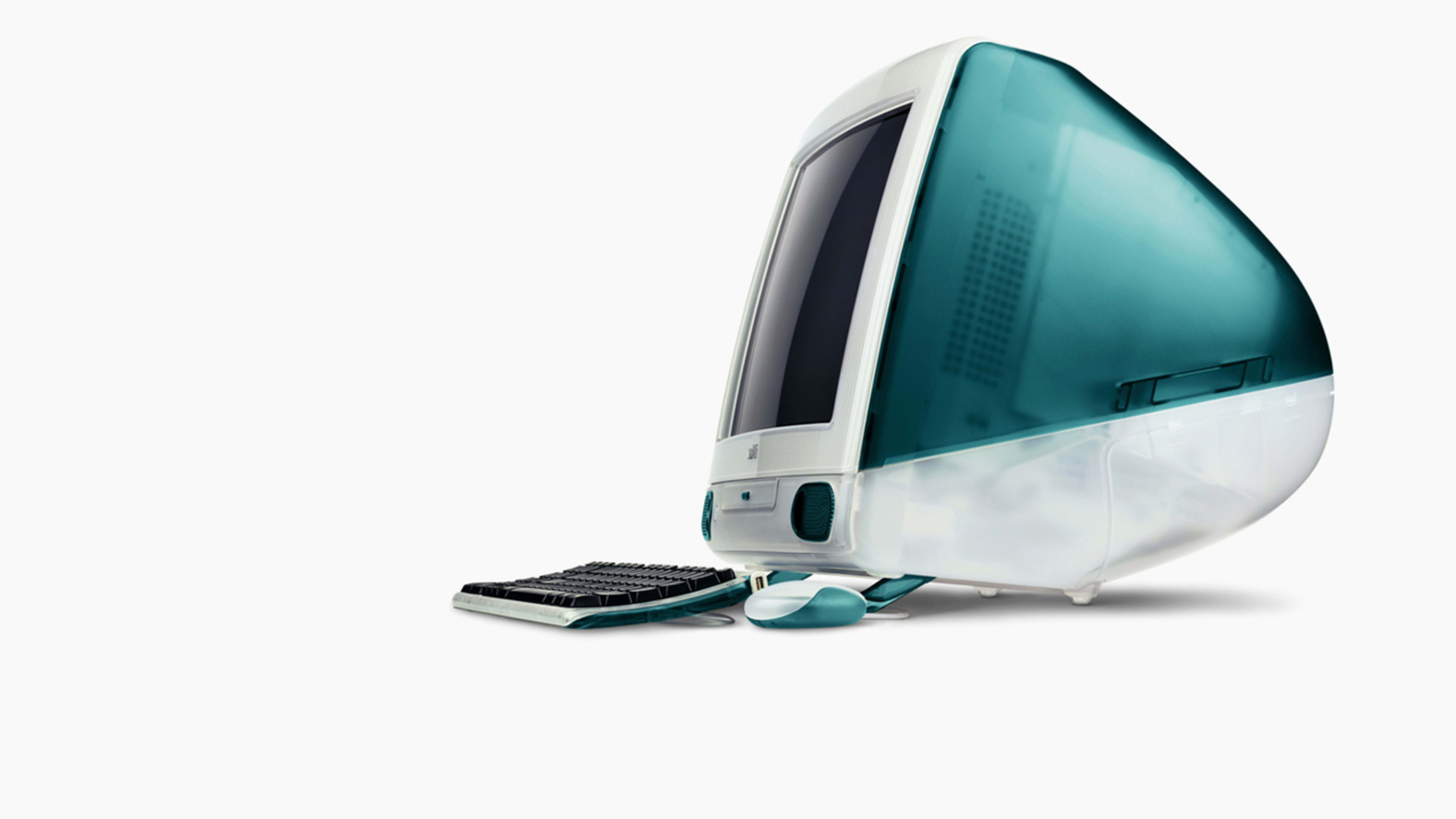
As large and robust as it looked, this is what inspired people. Let's detract from physical design and now look at actual digital design.

This layout was known as Skeuomorphism. It's derived from the idea that applications should be designed with a realistic look, as if it's imitating the application in real life.
This nostalgia is amazing with this design, as it reminds me of a different internet culture that dominated the market. I was able to watch youtubers like Smosh, listen to Imagine Dragons, and play jetpack joyride.

Looking back at having an ipod, I can appreciate the delicacy of the old design, as it was when technology was young and in its prime. My personification continues when describing how this digital design matured as time past, and maybe not for the better.
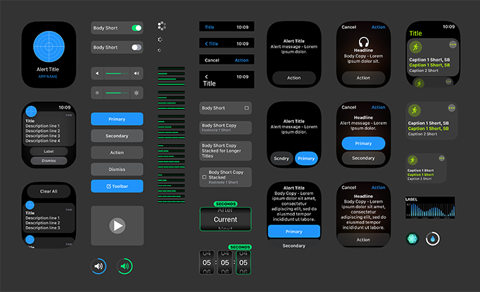
One day, someone from somewhere decided to pioneer a new look for the iphone, and subsequently every other industry pursueing the same market... The flat design...

This design focused more on the abstraction of ideas rather than the realism, resulting in designs that are *supposed* to convey universal meaning rather than hold anything tethered to specific representations or contexts. The design choice was clever because it was based off the fact that people already consumed so much of the old design that symbolism
was the only thing that was needed to represent certain applications now.
Even now, windows gives in and sells its soul to the flat design. The apple overlord influence is extremely powerful.

This is where, I argue with my humble jolly opinion, everything started to fall into corporate world.
The flat design propogated outside of digital design, and into PR media, advertisments, quota boards, and into every VC's brain.
Propogated...
Propogated it did....


Known as corporate memphis, I believe flat design evolved to influence the corporate world by incorporating the lifeless and symbolic artstyle into something more than just for
an operating system. Souless and unmoving, corporate memphis is meant to be insufferable. When companies flock to the next best thing, that also means they all sit on the same power cord - until it gets too heavy and it all explodes.
The worst part is that corporate memphis is here to stay. Despite it's heavy critic on being extremely uninspiring, companies double down on this
oversaturated design. Naturally, with apple, they would shift to something new, and everyone would follow, but something has clearly changed with their leadership. Everyone wants to stay for the long game and not risk a new design,
and as a result, there is no more motivation to reinvent the wheel.
Ignoring my whining for a minute, although the flat design is nearing its expiration date, the mainstream world still appeals to its familiar look. Furthermore, the minimalistic design
provides an insight as to what future designs may hold.
In conclusion
Although Apple's UI design was a huge leap forward in operating system visual design, they continue to stagnate on repetitive trends that entails another reinvention yet again.
References
https://www.interaction-design.org/literature/topics/skeuomorphism.